Plotting spectra |

Plotting overlay spectra is one of several ways to visualize data that you measured and that are now stored in computer memory. There are two ways to make matrix overlay: command-line style and graphical interface style. Command-line style is less intuitive but faster. Graphical User Interface is more intuitive but lakes more clicking. Read both recommendations and use whichever way you prefer – results are identical. Graphical User InterfaceIn the first step follow recommendations on advanced plotting found here. Note that data stored in the matrix can be plotted only in the “” mode of or dialogs. Simple form of the dialog (“”) will not display matrices, although CP_ and RP_ waves will be listed. When displaying the first spectrum from the matrix though dialog, select matrix as a Y Wave (left) and RP_ wave as an X Wave, then click button. A new line will appear in the window in the lower half of the dialog. Note that matrix name will have two pairs of square brackets. The first set designate the range of rows that should be displayed - for HPSpec data this is [0,910]. The second pair indicates which of the columns to display. Because rows are already designated as a range from point 0 to point 910, column can be only a single value. Set this value to 0 to display the first spectrum. You can press button again and the second line will be appended to the list. Keep settings on the second line identical to the first line, except to change the value of column from 0 to 1. This will indicate the second spectrum. You can proceed to add other spectra incrementing column index every time until you listed every column in the matrix, or you can list only a few. You can always add spectra to the plot through dialog in menu. Command lineEven faster way to append all spectra to graph is thorough command line. Bring command window forward by selecting it or by pressing . In the command line (lowest, editable line) type: Return to command window and execute the following command: Now the second spectrum is appended to the graph created in the next step. Note that the column index incremented to one. Copy the above command from the history menu and continue to append successive spectra to graph by incrementing column index each time. Setting scalesYou may notice that changes in the absorption of overlaid spectra are congregated on the left of the plot. To make it easier to see changes, set the bottom scale to cover region of 200 to 400 nm – this is ultraviolet region just outside visibility for human eye. Double-click the values at the bottom scale and set new limits in Min and Max fields. Measured spectra have different aberrations on the lower and upper limits of useable range. However, the lower limit cannot be properly examined when intensity scale is set to automatic value. To examine change at the lower end of useable range double-click values on the left axis and manually set the range to be from -0.01 to 0.05. In this range examine the spectra with lowest concentrations and notice that below certain limit absorption signal cannot be seen due to noise.
What do spectra show?Spectral overlay illustrates several important properties of spectra:
|
| Next: Profiles overlay plot |
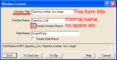 To keep the graphs of both the lower and upper ranges, it is convenient to make a copy of the graph. For that, call window control dialog from
| Comments |